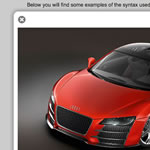
RokBox is a mootools powered JavaScript slideshow that allows you to quickly and easily display multiple media formats including images, videos (video sharing services also) and music.
RokBox provides a theme system that allows you to create your own custom ones to fit your websites design. It includes two predefined themes, a Light theme and a Dark theme that will fit seamlessly into your site design. RokBox is as easy as pie to install and customize, providing an easy way to create your own custom themes for it.

Features
- Mootools v1.2 compatible
- 4 Customizable Transition Type: Fade, QuickSilver, Growl, Explode.
- Support for Images, QuickTime (.mov), Windows Media Video (.wmv), Flash (.swf), YouTube, DailyMotion, MetaCafe, Google Video, Vimeo, Audio (.mp3, .wav), local and remote sites.
- Support for albums/categories.
- Support for Captions including support for titles and descriptions.
- 3 Predefined Themes provided: Light Theme, Dark Theme, Mynxx.
- Support for custom themes with ability to customize styles and RokBox configuration per theme.
Configuration
Once activated, the RokBox configuration panel can be found under the link RokBox Settings in the Plugins SubPanel.
This is a breakdown of all the configuration options of RokBox:
Preset Themes: From here you can choose which theme you want to use. Coming with RokBox you have Light, Dark, and Mynxx themes, but RokBox allows you to create your own Custom theme (explained below) and in this case you’ve to select Custom from the dropdown and write your theme name in the Custom Theme editbox.
Custom Theme: Here goes the name of your custom theme. To make RokBox loading this theme, make sure that you’ve selected "Custom" from Preset Themes.
Use Custom Settings: You can either use the default settings for RokBox, or you can set your own custom settings by selected Yes.
RokBox Default Width/Height: When you don’t specify a size for your links, RokBox will open with these default sizes.
RokBox Transition Effect: The transition type, provided by MooTools, to use when open/close RokBox.
Duration: How long, in milliseconds, the opening of RokBox should take.
Chase: The chasing, in pixels, for the Growl effect only.
Type of Animation: The type of animation to use when opening RokBox. You can choose between Fade, QuickSilver, Growl and Explode.
Borders Width: If you’re going to make your own custom theme and adding some extra borders, you may want to specify the width of borders in pixel. Light and Dark themes, for example, have this option set to 20, infact RokBox adds an extra 20px for each side.
Content Padding: The inner padding, in pixels, to use where media content appear, could be useful in some circumstances. Light, Dark, and Mynxx themes have this option set to 0.
Arrows Height: When navigation arrow appear because of an album set, RokBox adds an extra height based on this option setting, useful for having RokBox global height fitting well with arrows also. Light, Dark, and Mynxx themes have this option set to 35.
Show Captions: Whether or not RokBox should show the links captions. If enabled, and a link doesn’t have the caption in it, caption won’t appear also.
Captions Delay: How long caption should take before appearing.
Follow when Scrolling: This option allow RokBox to follow your page even when scrolling. If disabled, RokBox will stay fixed at it place when you scroll up or down.
Enable Keys: Enable or disable 3 keys shortcut. Esc, Left and Right. Which respectively Close RokBox, Go to previous album and Go to next album.
Overlay Background: Background color for Overlay. Must be a hexadecimal value with a prepending hash ‘#’.
Overlay Opacity: Opacity for the Overlay that goes from 0 to 1 with floating point allowed. Note that having Overlay set to 0 will not let you close RokBox by clicking on it, because 0 means invisible. To have it transparent but clickable also, set Overlay Opacity to 0.1.
Overlay Duration: How long the Overlay animation should take in milliseconds.
Transition Overlay Effect: The transition type, provided by MooTools, to use when openin/close the Overlay.
Autoplay: Whether or not play automatically movies from QuickTime and Windows Media Player.
YouTube Autoplay: Whether or not play automatically YouTube movies.
YouTube High Quality (HD): Whether or not enable the HD functionality of YouTube. If a HD video isn’t supported, the default Quality would be played. You cannot enable or disable the HD functionality for specified videos. All or none.
Controller: Wheter or not show QuickTime and Windows Media Player controllers.
Background Color: Sets the background color for those movie types that supports it (as for QuickTime). It must be a color in hexadecimal format with a prepending hash ‘#’.
Vimeo Color/Portrait/Title/Fullscreen/Byline: Enable or disable Vimeo Options. The color must be in hexadecimal format without any prepending hash ‘#’.